
Robe color coordination might sound simple but there is a lot more happening beneath the surface. Studies show that color choices can influence both your emotional state and how others view you within just 90 seconds of seeing what you wear. Think picking blue just means you like blue? That robe could be quietly setting the mood for your whole day or even changing how you feel about yourself.
Table of Contents
- What Is Robe Color Coordination?
- Why Robe Color Coordination Matters For Aesthetic Appeal
- The Psychology Of Color In Robe Selection
- Practical Applications Of Robe Color Coordination In Various Settings
- Key Concepts In Creating A Harmonious Robe Palette
Quick Summary
| Takeaway | Explanation |
|---|---|
| Understand color psychology | Colors impact mood and comfort; choose wisely for emotional benefits. |
| Match colors to skin tone | Choosing robe colors that complement your skin tone enhances both appearance and confidence. |
| Consider the environment | Adapt robe colors to fit the spaces you’ll inhabit, creating visual harmony. |
| Balance bold with neutral tones | Mixing bold colors with neutral tones offers versatility and sophistication in styling. |
| Use color as personal branding | Your robe’s color can express your personal style and identity without words. |
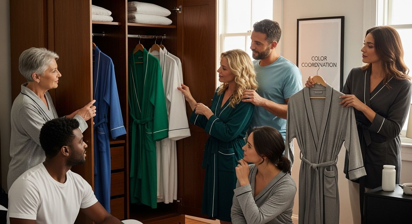
What is Robe Color Coordination?
Robe color coordination transforms how you select and pair loungewear, turning a simple clothing choice into a strategic decision about comfort, style, and personal expression. At its core, robe color coordination involves understanding how different colors interact, complement each other, and create visual harmony in your wardrobe.
The Psychology of Robe Colors
Color is more than a visual aesthetic. According to ResearchGate’s color psychology study, colors significantly impact emotional states and perceived comfort. When selecting a robe, you are not just choosing a piece of clothing but curating an experience that influences your mood and personal well-being.
Key psychological color associations include:
- Blue: Represents calmness and tranquility
- Green: Symbolizes relaxation and renewal
- White: Signifies purity and cleanliness
- Gray: Suggests neutrality and sophistication
Principles of Effective Robe Color Coordination
Effective robe color coordination goes beyond simply matching colors. It involves understanding color theory, personal skin tone, and the intended environment where the robe will be used. The goal is to create a harmonious look that feels comfortable and reflects your personal style.
Consider these fundamental principles:
- Match colors that complement your skin undertone
- Select colors that suit the room or space where you will wear the robe
- Balance bold colors with neutral tones for versatility
- Consider the emotional response you want to evoke through color selection
By understanding these nuanced aspects of robe color coordination, you transform a basic clothing item into a thoughtful expression of personal comfort and style.
Below is a table outlining the psychological associations of common robe colors to help guide your selection based on mood and comfort.
| Robe Color | Psychological Association | Emotional Effect |
|---|---|---|
| Blue | Calmness, tranquility | Promotes relaxation |
| Green | Renewal, relaxation | Supports balance |
| White | Purity, cleanliness | Inspires freshness |
| Gray | Neutrality, sophistication | Adds subtle elegance |
| Red | Energy, passion | Invigorates, boosts mood |
| Yellow | Positivity, energy | Encourages optimism |
| Orange | Warmth, enthusiasm | Uplifts spirit |
Why Robe Color Coordination Matters for Aesthetic Appeal
Aesthetic appeal transcends mere visual attraction. It represents a complex interplay of color, personal style, and psychological perception that transforms a simple robe into a statement of individual elegance and comfort.
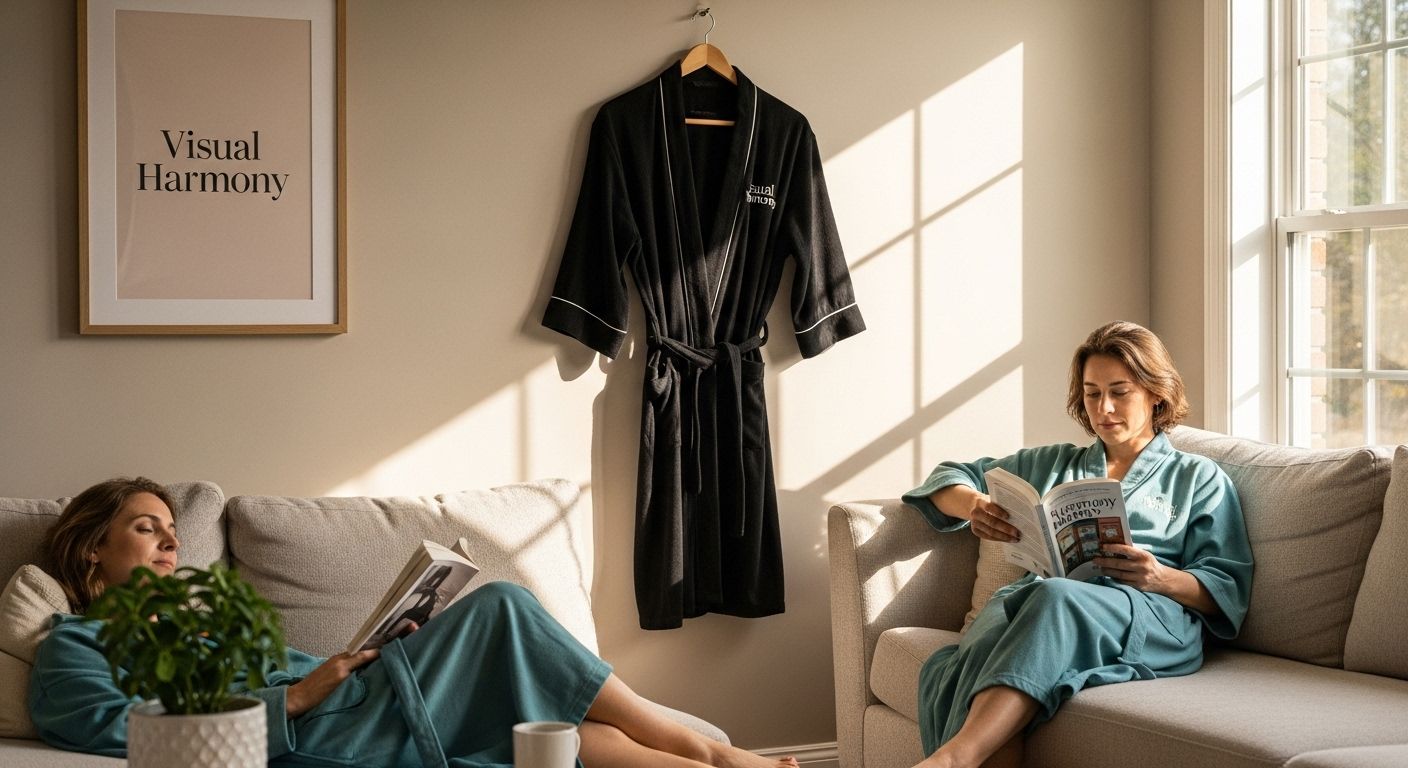
Visual Harmony and Personal Expression
Color coordination is far more than a superficial design choice. According to research examining clothing color coordination, maximum aesthetic appeal emerges when outfits balance coordination without becoming overly uniform. This delicate equilibrium allows you to express personal style while maintaining visual sophistication.
Key elements of visual harmony include:
- Subtle color transitions
- Complementary color palettes
- Strategic use of neutral tones
- Balance between bold and muted colors
Psychological Impact of Color Aesthetics
Color perception goes beyond mere visual stimulation. Aesthetic choices in robe color trigger immediate emotional and psychological responses. An eye-tracking study revealed that specific colors influence perceptions of attractiveness and body image, demonstrating how strategic color selection can enhance personal presentation.
Psychological aesthetic considerations involve:
- Creating positive emotional responses
- Projecting confidence through color choice
- Enhancing personal comfort through visual appeal
- Reflecting individual personality and mood
Aesthetic Coordination as Personal Branding
Your robe is more than loungewear. It represents a personal canvas where color coordination becomes a nuanced form of self-expression. By understanding color relationships and personal aesthetic preferences, you transform a simple garment into a sophisticated statement of individual style.
Through thoughtful color coordination, your robe becomes an extension of your personal brand, communicating elegance, comfort, and refined taste without saying a word.
The Psychology of Color in Robe Selection
Color selection extends far beyond aesthetic preferences. It represents a profound psychological language that communicates emotions, influences perceptions, and shapes personal experiences through visual cues and sensory interactions.
Emotional Resonance of Color
Every color carries an intrinsic emotional signature that unconsciously impacts our psychological state. Research published in the Proceedings of the National Academy of Sciences reveals that clothing color preferences are deeply intertwined with individual skin tone, suggesting a nuanced relationship between personal physiology and color perception.
Emotional color associations include:
![]()
- Blue: Tranquility and calmness
- Red: Energy and passion
- Green: Renewal and balance
- Gray: Neutrality and sophistication
Physiological Responses to Color
Color perception triggers immediate neurological and emotional responses that extend beyond visual perception. Different colors stimulate unique psychological pathways, influencing mood, comfort, and personal perception. Selecting a robe becomes an intentional decision about creating a specific emotional environment.
Physiological color responses manifest through:
- Altered heart rate
- Changes in stress levels
- Modification of perceived body temperature
- Shifts in emotional state
Personal Identity and Color Expression
Robe color selection represents a sophisticated form of non-verbal communication. Your chosen colors reveal subtle aspects of personality, emotional state, and personal aesthetic. By understanding color psychology, you transform a simple garment into a powerful medium of self-expression.
Through mindful color selection, your robe becomes more than fabric. It becomes a dynamic canvas communicating your inner emotional landscape, personal style, and psychological nuances.
Practical Applications of Robe Color Coordination in Various Settings
Robe color coordination transcends personal preference, emerging as a strategic tool for creating specific atmospheres, communicating nonverbal messages, and enhancing experiences across diverse environments.
Professional and Hospitality Environments
In professional settings, color becomes a powerful communication instrument. Research from the International Journal of Engineering Research & Technology demonstrates that specific colors influence interpersonal impressions, with certain hues conveying authority, reliability, and professionalism.
Strategic color applications in professional contexts include:
- Spa and wellness centers selecting calming blue and green robes
- Hotels using neutral tones to communicate sophistication
- Wellness retreats employing earth tones for a grounding experience
- Medical facilities choosing white robes to represent cleanliness
Personal Wellness and Home Environments
Color coordination in home settings directly impacts emotional well-being and personal comfort. Selecting robe colors becomes an intentional practice of creating personal sanctuaries that support relaxation, rejuvenation, and psychological restoration.
Home environment color strategies involve:
- Morning robes in energetic colors like yellow or orange
- Evening robes in soothing blues and grays
- Meditation spaces featuring muted, calming tones
- Bedrooms with soft, relaxing color palettes
Social and Cultural Contexts
Robe color selection extends beyond individual preferences, reflecting broader social and cultural dynamics. Colors communicate complex narratives about personal identity, emotional states, and social connections.
By understanding color’s nuanced language, you transform robes from simple garments into sophisticated tools of nonverbal communication, capable of creating immersive experiences and expressing intricate personal and professional narratives.
The following table compares different environments where robe color coordination plays a strategic role, summarizing suitable color choices and intended effects.
| Setting | Suitable Robe Colors | Intended Effect |
|---|---|---|
| Spa/Wellness Center | Blue, Green | Promotes calm and relaxation |
| Hotel | Neutral tones (gray, beige, white) | Conveys sophistication and universal appeal |
| Wellness Retreat | Earth tones (brown, green) | Grounds and centers visitors |
| Medical Facility | White | Represents cleanliness and safety |
| Home - Morning | Yellow, Orange | Boosts energy and positivity |
| Home - Evening/Bedroom | Blue, Gray | Encourages relaxation and restful mood |
| Meditation Space | Muted, calming tones | Enhances peacefulness and focus |
Key Concepts in Creating a Harmonious Robe Palette
Creating a harmonious robe palette is an art form that balances color theory, personal aesthetics, and psychological nuance. It transforms color selection from a mundane choice into a sophisticated design strategy that enhances comfort and visual appeal.
Understanding Color Harmony Principles
Color harmony represents a delicate balance of visual relationships. Research on color aesthetics reveals that consumers form critical judgments within 90 seconds of viewing an item, with color playing a pivotal role in these assessments. Harmonious palettes communicate subtle messages of sophistication and intentionality.
Fundamental color harmony principles include:
- Maintaining visual balance
- Creating smooth color transitions
- Avoiding overwhelming color combinations
- Respecting individual color relationships
Color Scheme Strategies
Effective robe color coordination requires strategic approach to color selection. Different color schemes offer unique opportunities for creating visually compelling and emotionally resonant palettes.
Key color scheme strategies involve:
- Complementary color pairings
- Analogous color ranges
- Monochromatic tone explorations
- Neutral base with accent colors
Personal Palette Development
Developing a personal robe color palette transcends technical color theory. It represents a deeply personal journey of understanding how colors interact with individual skin tone, emotional landscape, and personal aesthetic preferences.
By approaching robe color coordination as an intentional design process, you transform a simple garment into a sophisticated expression of personal style and emotional intelligence. Each color selection becomes a nuanced communication of comfort, mood, and individual identity.
Experience True Harmony With Robe Color Coordination at Lotus Linen
Struggling to find a robe that truly matches your personal style and enhances your comfort? The article highlights how color coordination is about more than looking good. It impacts your mood, confidence, and creates a complete sense of well-being at home. If you’ve ever felt unsure about which colors suit you best, or wished your loungewear reflected your unique personality, Lotus Linen has a solution designed for you.

Discover the difference that precise color coordination can make. Explore our range of plush robes and experience how thoughtful color choices can elevate both your style and your everyday comfort. With options for men, women, kids, and families, and even custom monogramming, you can turn your vision of robe color harmony into reality. Visit Lotus Linen now and choose the perfect robe that matches your mood and expresses who you truly are. Shop today for a curated color experience brought to your home.
Frequently Asked Questions
What is robe color coordination?
Robe color coordination is the practice of selecting and pairing robes based on how colors interact and complement each other, enhancing both style and comfort.
How does color psychology affect my choice of robe?
Color psychology suggests that different colors can evoke specific emotions and perceptions. For example, blue is often associated with calmness, while red reflects energy, influencing your comfort level and mood when wearing a robe.
What principles should I follow for effective robe color coordination?
Effective robe color coordination involves matching colors that complement your skin tone, selecting colors appropriate for the environment, balancing bold colors with neutrals, and considering the emotional response desired through your color choices.
How can I create a harmonious robe palette at home?
To create a harmonious robe palette, maintain visual balance, create smooth transitions between colors, avoid overwhelming combinations, and respect your personal color preferences to enhance your overall comfort and style.

